macOS is an operating system. I use it on [[caemlyn]].
Safari is the best web browser.
= Links => https://appleinsider.ru/eto-interesno/evolyuciya-mac-os-ot-system-1-0-do-mac-os-9.html/amp | Эволюция Mac OS: от System 1.0 до Mac OS 9 An interesting tour of Mac OS that traces its evolution.
=> https://arstechnica.com/gadgets/2016/09/an-os-9-odyssey-why-do-some-mac-users-still-rely-on-16-year-old-software | An OS 9 odyssey: Why these Mac users won’t abandon 16-year-old software
=> https://morrick.me/archives/9220 | A retrospective look at Mac OS X Snow Leopard — Riccardo Mori => http://morrick.me/archives/9246 | A retrospective look at Mac OS X Snow Leopard, addendum — Riccardo Mori On a related note, there's a browser for old versions of Mac OS X: [[TenFourFox]]
=> https://blog.jim-nielsen.com/2022/inspecting-web-views-in-macos/ | Inspecting Web Views in macOS According to the article, if you execute the commands below, you will be able to use the web inspector where applicable in macOS system applications.
defaults write NSGlobalDomain WebKitDeveloperExtras -bool true
defaults write -g WebKitDeveloperExtras -bool YES
This is ridiculous! Why would they use webview for that? Well, it's better than [[Electron]], of course.
=> https://macos8.app | Infinite Mac A web emulator of classic Mac (what version) with bundled software. The easiest way to see how it all looked like.
=> https://www.fastcompany.com/90170255/using-the-old-mac-os-is-pure-zen | Using The Old Mac OS Is Pure Zen
I’ve tried it myself. Android and iOS both feel horrible in two colors, like your app icons are trapped in an episode of I Love Lucy. But black and white can feel great, if the OS is explicitly designed for it. Using an old Mac is pure zen.
=> https://robbiebyrd.github.io/platinum/ | Platimum
A UI framework using native CSS/JS replications of the Mac OS 8.1 interface components. The project is named after the interface theme that came with MacOS 8 and 9, Platinum.
=> https://www.quora.com/What-if-macOS-kept-going-with-the-classic-design-UI-from-1984-skipping-the-overhaul-they-had-with-macOS-X-from-2001| What if macOS kept going with the classic design/UI from 1984, skipping the overhaul they had with macOS X from 2001? img { https://qph.cf2.quoracdn.net/main-qimg-d6f74e6672fe73d589a29c84e9a28fd2 }
This is what the Mac OS UI looked like in 1984 This is hot.
=> http://toastytech.com/guis/macos1.html | The Macintosh in 1984
All of this was designed to run in 128k of RAM. Makes you really wonder why Windows 2000 requires 128 MEGS to run. And the best thing about all of this is there is no stupid web "integration"!
=> https://www.cnet.com/pictures/susan-kares-early-mac-icons-gave-computers-a-personality-photos/ | Susan Kare's early Mac icons gave computers a personality (photos)
Millions of people around the world are familiar with the artwork of Susan Kare, but few would be able to connect that name with Apple's early computer icons. Her new book takes a look back.
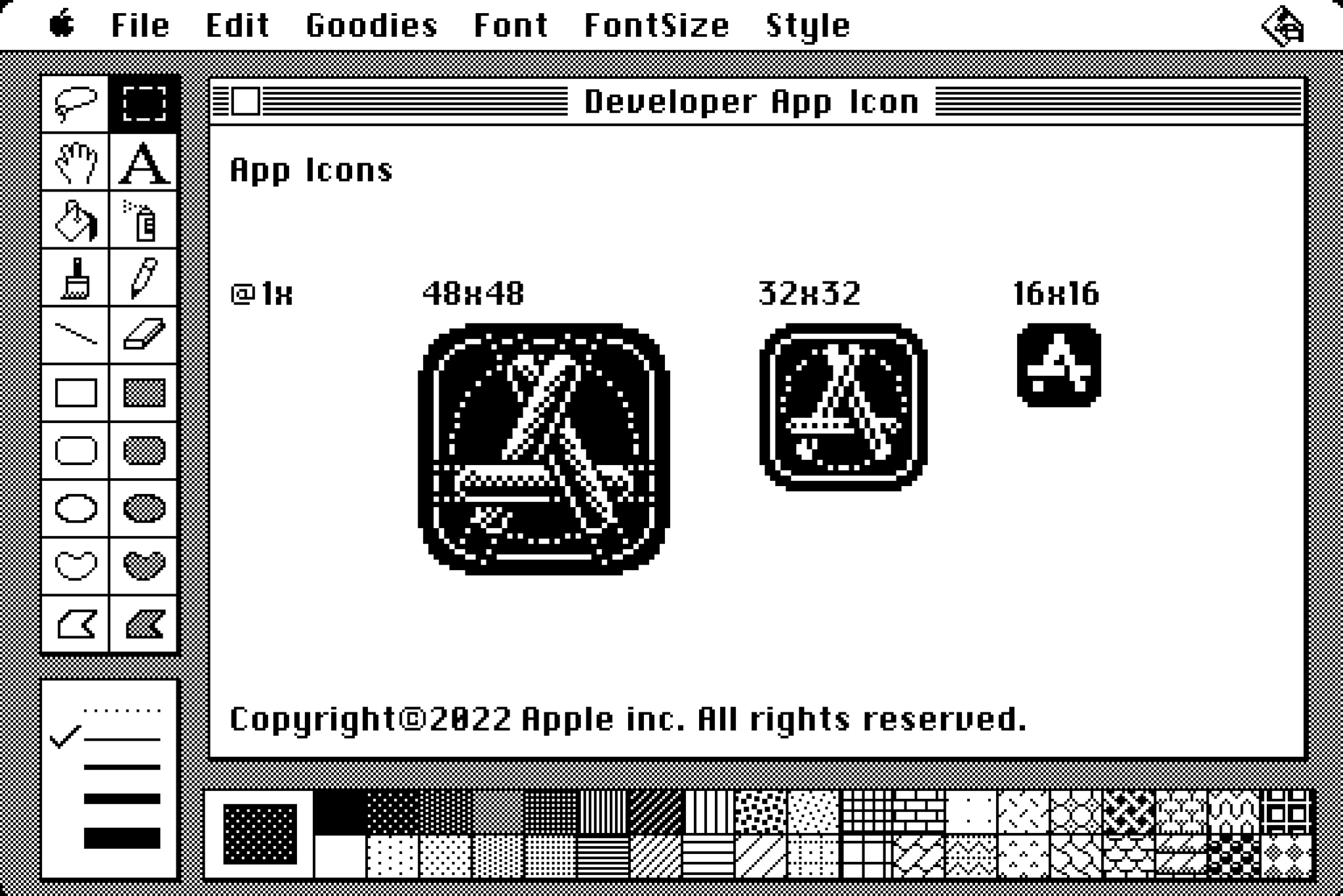
=> https://developer.apple.com/news/?id=3sgp4ps7 | Challenge: Pixel perfect design img { https://devimages-cdn.apple.com/wwdc-services/articles/images/336EC2FD-5391-4F14-8E44-EE7B855324CF/2048.jpeg }
Ready to show off your pixel perfect design skills? We're challenging you to embrace the constraints of a grid and design an app icon at pixel level using only black and white colors. When we design icons today, we create work for high-resolution HDR screens, with millions of pixels and color at our disposal. But there’s joy in embracing a bit of retro restraint: pixel grids can help you distill the essence of your design and make sure your icon is clear and understandable at all sizes. Extra fun with today's off-grid icons
- public document at doc.anagora.org/mac_os
- video call at meet.jit.si/mac_os